GC
Growing companies
“Is there a floor that fits our team?”
NEEDS
Flexible floors they can grow into.
→ Floor specs
Available for new projects · Limassol
CASE 04 · UI/UX & DIGITAL PRODUCT DESIGN
Selling 2,068 m² of green office space in Larnaca before the building exists.
01 — PROBLEM
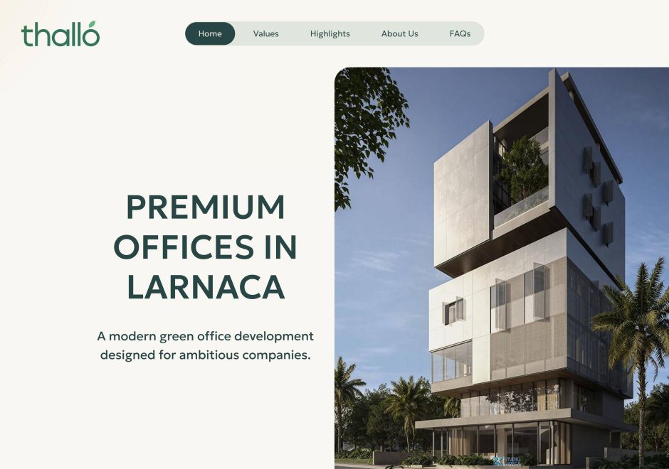
Thallo is still under construction, so there is no finished building to show. Companies looking for an office need to picture the space, understand what they can rent and decide if it is worth a viewing — all from renders and plans.
How might we help a company understand the building and the available space in one visit, and make booking a viewing the natural next step?
02 — RESEARCH
Main finding: companies choosing an office look for hard facts first — size, location, features, completion date. Clear numbers beat lifestyle text.
03 — AUDIENCE
Who the site is for, what each group needs, and the page that answers it.
“Is there a floor that fits our team?”
NEEDS
Flexible floors they can grow into.
→ Floor specs
“Can we take all of it?”
NEEDS
The whole building under one lease.
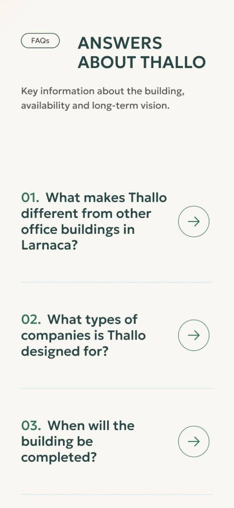
→ FAQs
“How will it work day to day?”
NEEDS
Parking, EV charging, climate control.
→ Features
04 — JOURNEY MAP
What a visitor does, thinks and struggles with at each step, and the design decision that answers it.
DOING
Sees a listing or ad
THINKING
“What is Thallo?”
PAIN POINT
Nothing finished to visit
DESIGN RESPONSE
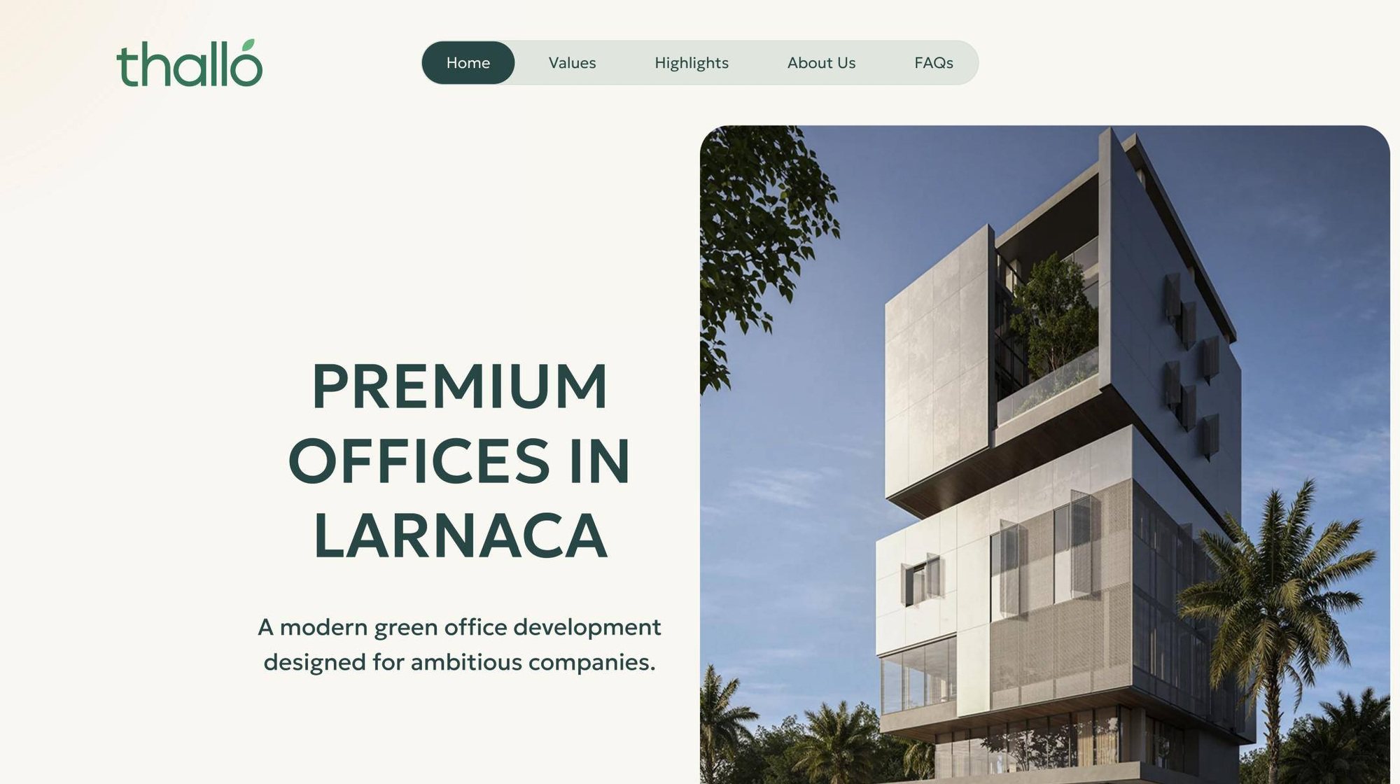
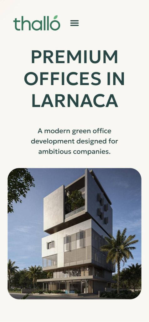
Clear headline and render
DOING
Scrolls the page
THINKING
“Why this building?”
PAIN POINT
Lifestyle text instead of facts
DESIGN RESPONSE
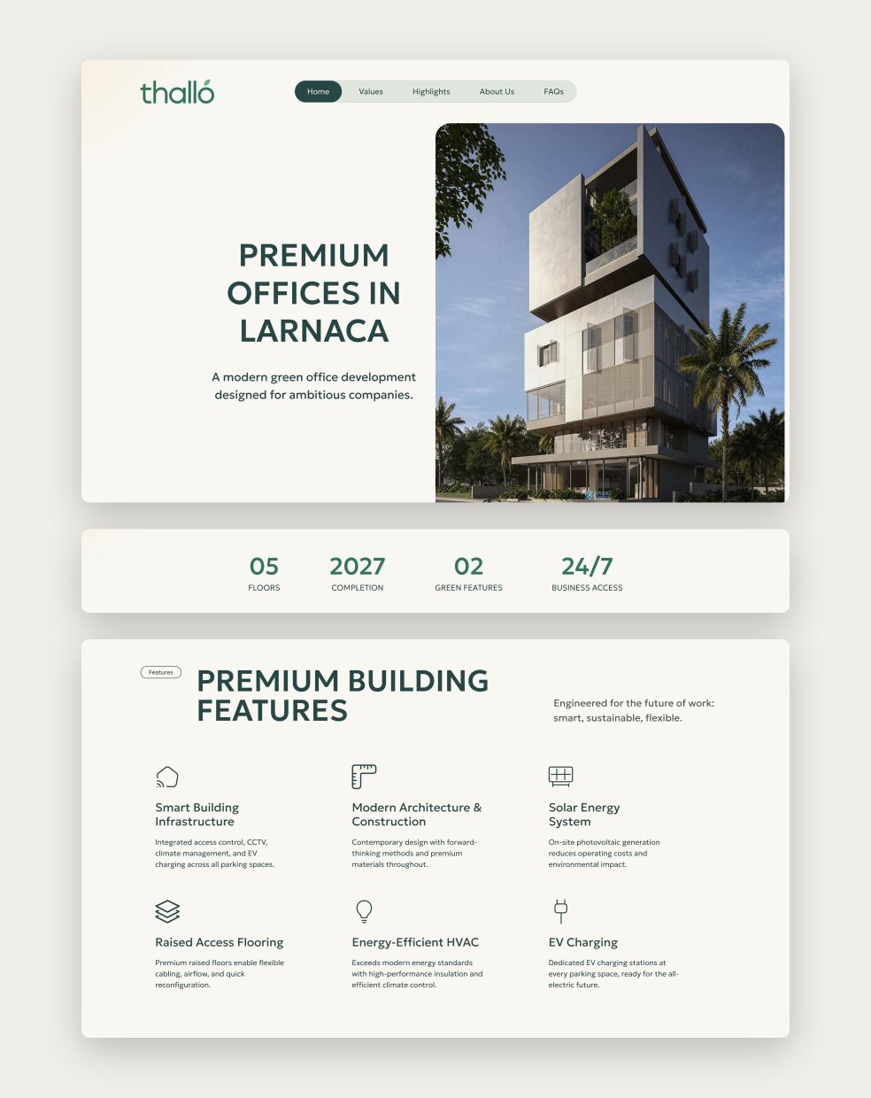
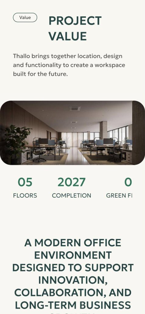
Key facts row with numbers
DOING
Looks at renders
THINKING
“What will it feel like?”
PAIN POINT
Hard to imagine from plans
DESIGN RESPONSE
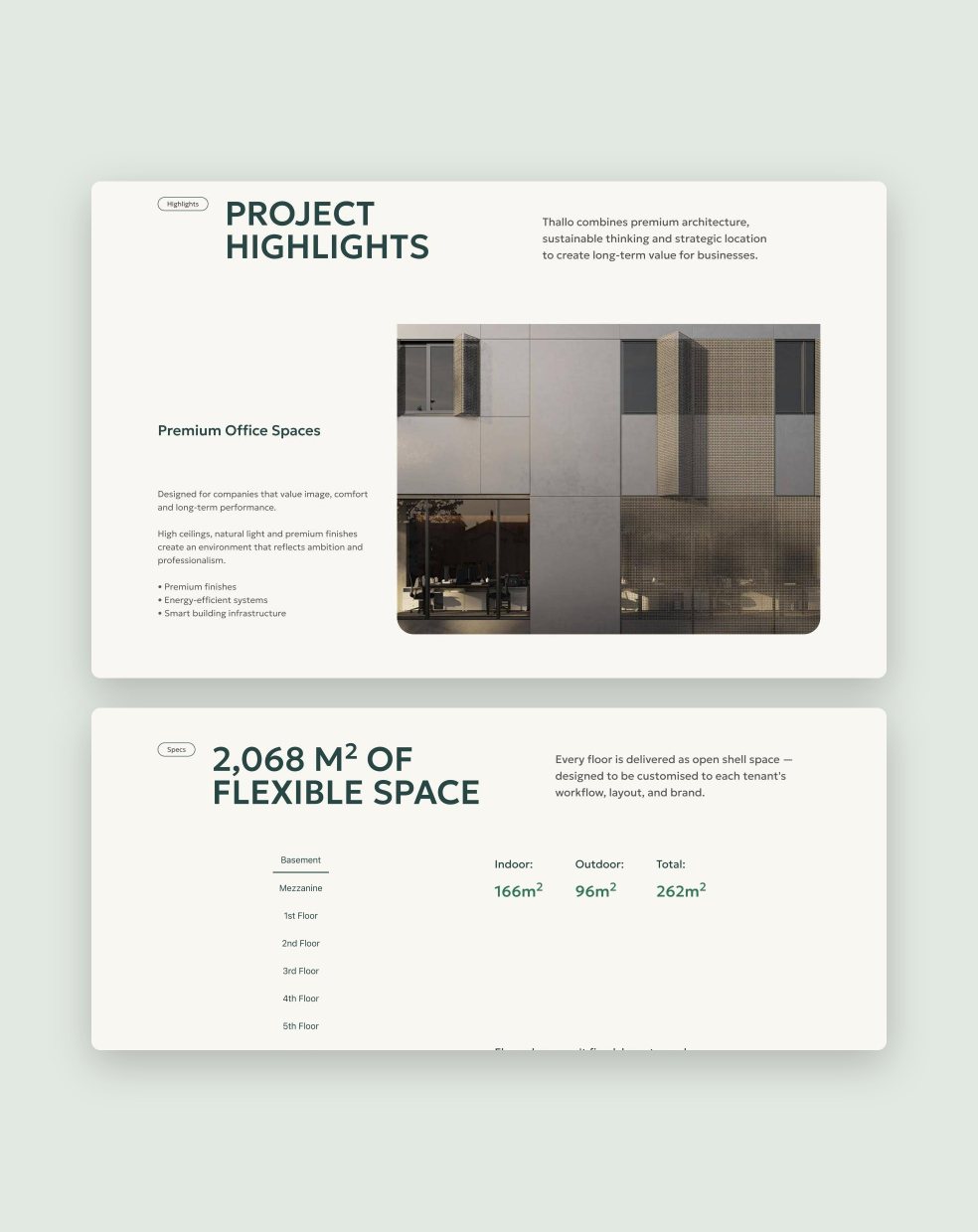
Interior renders in Highlights
DOING
Checks floors and features
THINKING
“Which floor fits us?”
PAIN POINT
Areas spread across PDFs
DESIGN RESPONSE
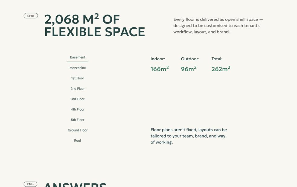
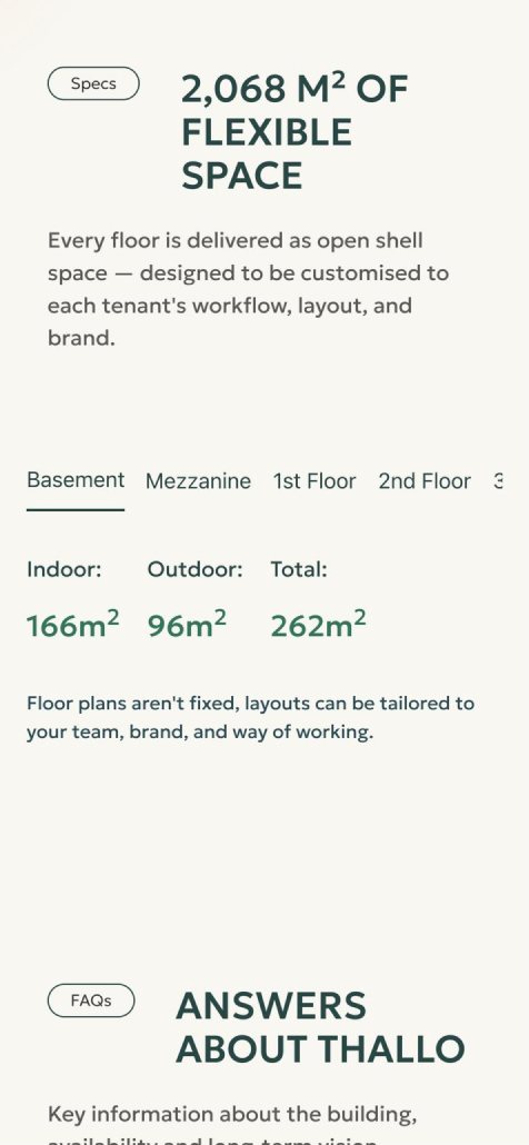
Floor tabs: indoor, outdoor, total
DOING
Requests a viewing
THINKING
“Can we see it soon?”
PAIN POINT
Long contact forms
DESIGN RESPONSE
Four-field form behind Book a Meeting
05 — HYPOTHESES
Five hypotheses, each with its own metric. Drawn as variants of one component: same structure, different bet.
❖ Hypothesis
“Premium Offices in Larnaca” with a “Book a Meeting” button explains the offer in one screen.
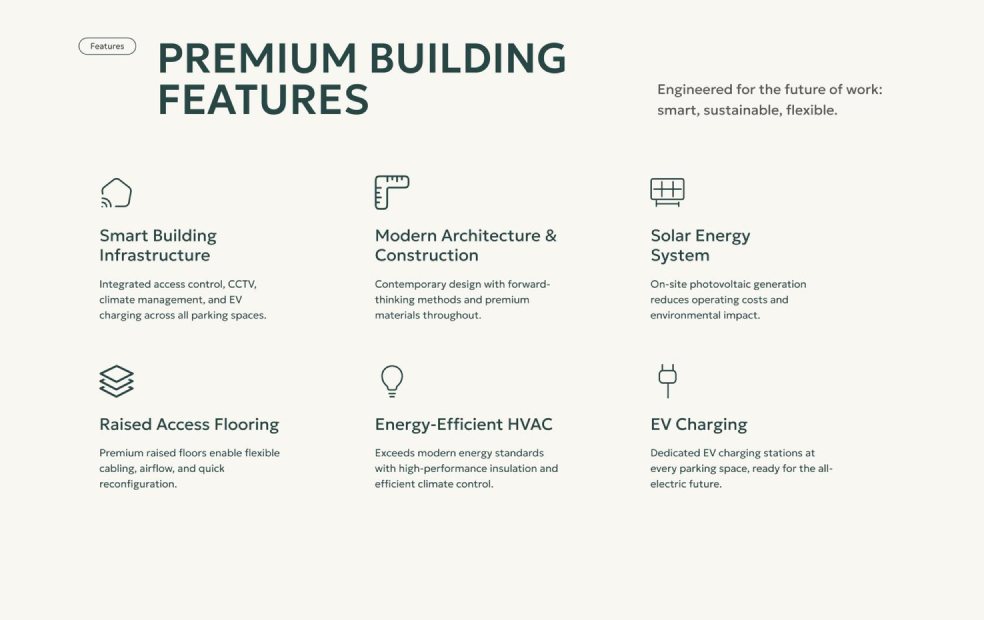
Six feature cards are easier to scan than long text.
Floor tabs with indoor, outdoor and total area help companies find the right space.
An FAQ answers common questions and reduces simple enquiries.
A four-field form increases viewing requests.
06 — PRIORITISATION
Each hypothesis placed by expected impact and the effort to build it. The headline with Book a Meeting and the short form went first; floor tabs were a big bet, as every floor needed checked areas.
07 — VISITOR FLOW
The main paths through the site, including where visitors split.
08 — SITEMAP
Information architecture agreed with the client before wireframes.
09 — WIREFRAMES TO UI
Low-fidelity layout first, agreed with the client, then the final interface.
10 — SOLUTION
 124
 3
The site has one job — viewing requests — so everything sits on one page.
Floors, completion, green features and access as short numbers.
Three stories with interior renders: premium offices, eco working and raised ceilings.
Smart building, solar, raised floors, efficient HVAC, EV charging, architecture.
Nine floor tabs, each with indoor, outdoor and total area.
One long page keeps the path short but needs clear section titles.
11 — SCREENS
Key screens on desktop and mobile.
12 — WHAT WE MEASURE
Each hypothesis is tied to one event on the live site. Targets are set once the first month of data gives a baseline.
13 — RESULTS
Reviewed with the client at wireframe stage and with the agency before development, then checked on desktop, tablet and mobile. After launch, hero clicks, floor tab clicks and form submissions are tracked.
When a building does not exist yet, clear numbers and good renders do most of the selling. Next: interactive floor plans, a construction progress section and a brochure download for an email.